RmlUI - New GUI rendering engine & skinning system
August 18, 2025
Version 2.0 of our plugins come with a completely new GUI rendering and skinning system: RmlUI
RmlUI is a UI engine that is loosely based on html / CSS2, but written entirely in C++ and supports hardware accelerated rendering.
Skin developers are encouraged to read the RmlUI Documentation to know how skins have to be developed.
Previous versions used the Juce UI framework. We extended this by introducing a json based UI definition to provide basic skinning abilities. However, this system had several drawbacks that we wanted to get rid of:
-
Slow software rendering (Juce 7, Windows)
-
Text rendering issues (Juce 8)
-
Rendering differences between platforms
-
No built-in method for data driven layout or skinning
RmlUI, based on CSS2 and html, offers a much greater flexibility:
-
It will improve our iteration times when developing the UI for future plugins due to automatic layouting capabilities, such as tables, flex boxes and weights
-
The cascading style sheets allows skin designers to apply their vision of a great UI to our plugins at a much larger extent. Hardware accelerated rendering on all platforms and an integrated animation system are the fundamentals for a modern and flexible UI.
For this to work, we had to rewrite everything related to the GUI of our existing plugins. Osirus & OsTIrus are the first plugins that are released with the new UI system, the other plugins will follow soon.
- Existing Skins
- Custom Controls
- Data Binding
- Parameter Binding
- Built-in data for RmlUI
- Includes
- Debugging
- Use it wisely
Existing Skins
There are a lot of skins out there for our plugins and we do want to keep them. That’s why we’ve created a skin converter that converts old json based skins to RmlUI when loading them for the first time.
Note that automated skin conversion might imply subtle differences to the previous look, especially for text rendering. It is meant to be a tool for skin developers to help conversion of the json based skin files to rml/rcss based skins. It is recommended that authors of skins use the automated conversion as a starting point before manual polishing and do a re-release.
If you use a json based skin, ask the skin developer for an update. All skins that are integrated in our plugins have been converted already.
Custom Controls
We have extended RmlUI slightly with some custom controls that didn’t exist before.
| Element Tag | Description |
|---|---|
| button | A button that can be bound to a plugin parameter. |
| combo | A dropdown menu to adjust a plugin parameter |
| knob | A rotary knob to adjust a parameter |
| splitter | A vertical element that can be used to adjust the size of two neighbouring elements |
button
The button is an element that can modify a parameter or change its current value. The following attributes exist:
| Attribute | Description |
|---|---|
| isToggle | If set to one, the button is a toggle button, i.e. it will toggle the “checked” state every time it is clicked |
| valueOn | The value to send if the button is checked. If not specified, default is 1 |
| valueOff | The value to send if the button is unchecked. If not specified, the default is 0 |
Note that if you specify a value for valueOn you also may want to specify a value for valueOff, otherwise, a parameter is not modified if the button becomes unchecked.
By leaving valueOff unspecified you can have multiple toggle buttons side by side to create a selector, for example, to select a filter type of a synthesizer. An example how this can be done in the latest version of OsTIrus:
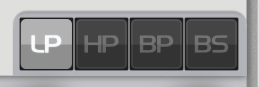
<div .... data-model="partCurrent">
	<button id="Filter1Mode_LP" isToggle="1" param="Filter1 Mode" valueOn="0"/>
	<button id="Filter1Mode_HP" isToggle="1" param="Filter1 Mode" valueOn="1"/>
	<button id="Filter1Mode_BP" isToggle="1" param="Filter1 Mode" valueOn="2"/>
	<button id="Filter1Mode_BS" isToggle="1" param="Filter1 Mode" valueOn="3"/>
</div>
combo
The combo element opens a dropdown menu as soon as it is clicked and displays the current value of a parameter as text. Example:
<combo data-model="partCurrent" param="Lfo3 Destination"/>
	<combotext/>
</combo>
The combo element uses a child to display the text value to allow free placement of the text inside its parent.
The following property / attribute can be set (either via RCSS property or attribute directly on the element):
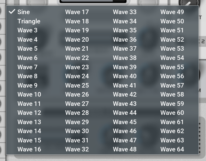
items-per-column
Set this to any number greater than zero to specify the number of rows that are displayed per column before a new column is created. This allows to display values in a grid. It may be useful for parameters with a lot of values to select from. An example from OsTIrus is the wave select parameter, it uses a value of 16:
knob
The knob is similar to a horizontal or vertical slider but uses a spritesheet to display the current value, it can be used for rotary knobs.
It requires to have a style attached and that style needs to have the following two properties set:
| Property | Description |
|---|---|
| frames | The number of images that should be used. Example: 128 |
| spriteprefix | The prefix that should be used to address a sprite of a spritesheet. The prefix is used and concatenated with a 3 digit number to define the sprite name that is used to display the current value |
Example:
RCSS
...
@spritesheet knob_small
{
	knob_small_000: 0px 0px 70px 70px;
	knob_small_001: 70px 0px 70px 70px;
	knob_small_002: 140px 0px 70px 70px;
	.....
	knob_small_127: 770px 280px 70px 70px;
	src: knob_small.png;
}
.mySmallKnob
{
	frames: 128;
	spriteprefix: knob_small_;
}
...
RML
...
<knob class="mySmallKnob" data-model="partCurrent" param="Lfo1 Rate"/>
<knob class="mySmallKnob" data-model="partCurrent" param="Lfo2 Rate"/>
<knob class="mySmallKnob" data-model="partCurrent" param="Lfo3 Rate"/>
...
Data Binding
RmlUI supports data buindings in various forms. To get an overviev you’re encouraged to read the RmlUI documentation.
We defined the following data models:
-
plugin
-
partCurrent
-
part0 - part15 (the actual number of parts depend on the emulated device)
plugin
The plugin data model has the following attributes that can be used to display the plugin name or version information and provides some other useful things:
| Attribute | Description | Examples |
|---|---|---|
| name | The plugins name | Osirus |
| vendor | The plugins vendor name | The Usual Suspects |
| versionString | Version number as human-readable string | 2.0.0 |
| versionNumber | Version number as integer | 200000 |
| versionDate | The build date | Aug 13 2025 |
| versionTime | The build time in 24 format | 23:45 |
| versionDateTime | The build date and time combined | Aug 13 2025 23:45 |
| deviceModel | The specific device model that is being emulated. This is currently only used for Osirus & OsTIrus but might get used for future plugins as well. By using this you can disable certain controls that are not available on all models. | A, B, C, TI, TI2, Snow |
| multiMode | For devices that support this, indicates if multi/performance mode is enabled, i.e. multiple parts are active. The value is 1 if enabled, 0 otherwise | 0, 1 |
| currentPart | Indicates which part is currently selected. If multi mode is not enabled, this value is 0 | 0 - 15 |
| today | The date of today in format YYYY-MM-DD | 2025-10-31 |
partCurrent and part0 to part15
The data models partCurrent and part0 - part15 contain information about every exposed plugin parameter.
While part0 to part15 contain the parameter values for each individual part, partCurrent contains the parameter values for the part that is currently selected.
Note that all parameters that do not have a part, for example parameters for a Multi, are available as part0.
The parameter definition for each plugin is a json file that is included in the plugin, the parameter property that is used for RmlUI from the json is name:
As an example, we use the parameter Filter1 Mode from Osirus. Due to the nature of rml, the parameter name is modified to result in a valid variable name. Therefore, all spaces are replaced by underscores.
The following variables for this parameter are available:
| Variable Name | Example Value |
|---|---|
| Filter1_Mode_value | 2 |
| Filter1_Mode_min | 0 |
| Filter1_Mode_default | 0 |
| Filter1_Mode_max | 7 |
| Filter1_Mode_text | BandPass |
If you wanted to display the current value of the filter mode as text, you would do:
<div data-model="partCurrent"></div>
Parameter Binding
To bind a parameter to an element, a new attribute param has been introduced. Using this instead of binding to parameter variables directly is a strong requirement to make things such as hovering / tooltips work. It is not required to just display the current value of a parameter, as in the previous example in section Data Binding, but it has to be used for any element that the user can interact with.
Lets say that you want to bind a knob to the parameter Filter1 Mode, you can do that like this:
<knob data-model="partCurrent" param="Filter1 Mode"/>
By using this attribute you not only bind the current value but the parameter minimum, maximum and default values are bound too. Also, you can specify the parameter name as-is, as the attribute value is a string that is not restricted to the variable name scheme.
Built-in data for RmlUI
We have a couple of files that are integrated into our plugins to define a default style. All of these files can be overwritten by adding files with the same name to a skin folder.
However, this is strongly discouraged! If we update the files, your skins might break! The better approach is to define individual styles to overwrite the existing ones. Note that the last defined style has priority so all you need to do is to include the integrated styles first, then include your own styles to overwrite existing ones.
The plugins rely on certain data to exist, for example, the patch manager RmlUI elements need to be present somewhere or the plugin will report an error while loading your skin. Therefore, replacing default files with custom ones should be handled with care.
| File | Description |
|---|---|
| tus_default.rcss | Defines all global default styles for fonts, menus and more |
| tus_juceskin.rcss | Additional styles that are used for skins that are converted from json to rml. |
| tus_patchmanager.rcss / tus_patchmanager.rml | These two files are used to define the default style and the layout of the patch manager. The recommended approach is to not touch these but only generate overwriting styles in a skin. |
| tus_colorpicker.rcss / tus_colorpicker.rml | The color picker is used by the patch manager. |
You can find these files at https://github.com/dsp56300/gearmulator/tree/main/source/jucePluginData
Includes
You can (and should) use includes to structure your work. The integrated skins make use of both rcss includes and templates. An example from the integrated OsTIrus skin:
<link type="text/template" href="tus_colorpicker.rml"/>
<link type="text/template" href="tus_patchmanager.rml"/>
<link type="text/rcss" href="tus_default.rcss"/>
<link type="text/rcss" href="tus_juceskin.rcss"/>
<link type="text/rcss" href="VirusTI_Trancy.rcss"/>
However, please note that paths are not supported, neither relative nor absolute. The only valid href is a filename.
Debugging
RmllUI comes with an integrated debugger. This debugger allows you to render outlines of elements, furthermore you can select any element to inspect its properties.
The debugger is disabled by default. You can enable the debugger in the Developer Options.
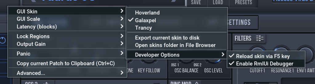
For faster skin development, once the Reload option is enabled, the skin is reloaded from disk immediately every time you hit the F5 key.
Use it wisely
The new skinning system is very powerful. If you want, you can change the style of everything, including all menus, icons, everything can be changed by overwriting existing default styles with custom ones that are part of a skin.
However, having the ability to do so does not mean that you should do so. Keep in mind that people are used to a consistent experience across our plugins, especially for global things like our patch manager or menus.